An Original reverse painted glass chandelier by artist Jenny Floravita
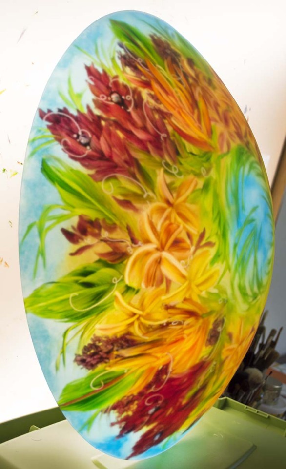
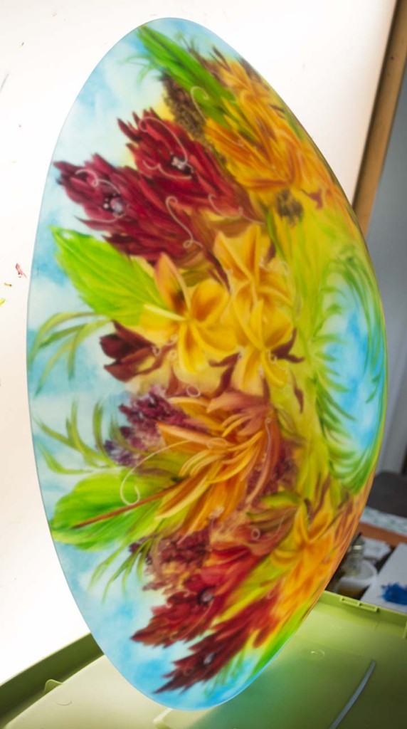
I’d like to share a beautiful custom, reverse painted glass chandelier that I did for a family this summer. This was a noteworthy project. The client really put a lot of thought into what she wanted in the chandelier. We spoke on and off for two years about this special piece. After much thought, she determined that the best design for her home would be a repeated section of flowers. Flowers included plumerias, orange heliconia, red heliconia, green leaves and palm fronds.
As all of my chandelier to date are Original, not based off patterns—this definitely was different. And I still wanted her to have the most artistic and unique piece possible. I wanted to give her the value of an original that has a flower design based on a repeating section. I didn’t want her to have a simple pattern chandelier.
The glass also had to have specific colors. Her room photos were great! But the elements that were truly helpful were the wall color chips and the fabric samples that she sent.
The color she was incorporating in her home were very specific. From this perspective, I immediately could understand why she liked this section of a painting—it had all the colors. Plus it expressed a softer tropical vibe, something that she also wanted to incorporate into her lake home.
The Design Challenges
Every custom painted chandelier has design challenges. In fact, all chandelier commissions are all difficult to some degree. And nearly every custom chandelier presents contractions within the requests.
With this piece, the color palate was very specific. The chandelier also couldn’t have a lot of gold yet the background color going around the wreath of Hawaiian flowers had gold elements. She did want to keep that look the same.
In my experience, soft golds, soft oranges, reds unfortunately flatten in photos. In real life, they are always gorgeous in my painted chandeliers chandeliers.
From a design point, I understood that from one flower to another there had to be contrast in colors for the design to be interesting. That can be difficult to pull off, painting in reverse, when the color palate is in a narrow range.
So for example, golds and oranges can blend together a bit (in photos) if there isn’t a starkly different color next to the flower.
Oranges and yellows will appear more bold if they are surrounded by radically different colors. That is the nature of contrast. In this case, I was very aware that the colors needed to match the fabric and wall samples.
Another way I created contrast was to vary the gesture of a couple of the flowers whenever possible.
The flowers fit four times around the glass.
The orange heliconias and plumerias were each painted with a different gesture. This created a natural look.
To keep a similar look through the entire design, I tried to keep the green leaves and the two red gingers in the same order.
The idea was that the client would have the same look from four different angles in her room.
Capturing the Beauty of Painted Chandeliers
With this particular color palate, I knew from experience that the most difficult part would be showing the true beauty of the artistry. Lights are notoriously difficult to photograph. Period.
More of the challenges that I described above can be with capturing the dynamics of the chandelier as you look around the glass.
In fact, when you look in magazines at rooms with chandeliers (or even ads where the feature is a chandelier), 9 times out of 10 the lights are turned OFF. To professional photographers (which I am not), apparently there are more challenges than it’s worth to show lights lit in rooms. Painted lights also present an added layer of unique difficulties.
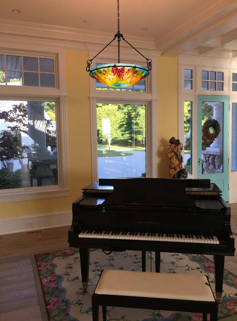
Once a glass bowl is painted, often I’ll send pictures off my light easel, like the one’s shown here. Sometimes I will send pictures of the light in a fixture. I’m always concerned with conveying the true beauty of the chandelier.
Together, we really did put a lot of thought into this chandelier. It has a very elegant feeling.
As a last note, I’d like to mention that the light is less yellow than the photos show. The plumerias and their background really have more of a transparent elegance to them.
This client spent at least four years building a beautifully designed home that is very livable and comfortable yet has opulence.
Below is one more picture, to show how a different side was painted. Thank YOU for letting me share this beautiful and special chandelier with you.

An Original reverse painted glass chandelier by artist Jenny Floravita

