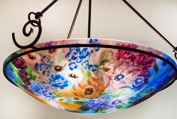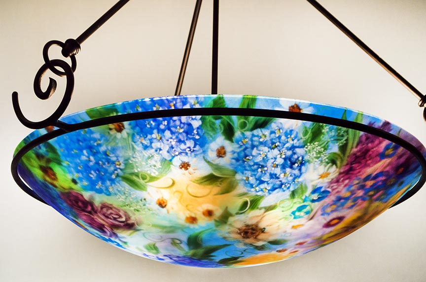
An Original reverse painted glass chandelier by artist Jenny Floravita. This romantic art light would be lovely for anyone who loves blue chandeliers.
Blue Chandeliers Are Romantic
Blue chandeliers are very trick to pull off and paint well. Through my professional artistic life, I’ve pained many chandeliers where the dominant color is a shade of blue. Requests for predominately blue chandeliers come and go in waves. Some years it seems like every other chandelier request involves blue as a primary color.
Blue is a beautiful color and it is my preferred accent color in my own home. I love aqua and cobalt and blues that are more turquoise. It’s a cooler color palate and it goes well with beige and sand colors—perfect for a home with an ocean vibe. It’s also very romantic when paired with sophisticated colors like mauve or grey hues— these are colors I often work with when rooms require a more traditional feeling.
When clients ask for blue chandeliers, I first ask for a specific color palate to help identify the shades of blue that my client is looking for in their custom painted chandelier. These would be specific blue hues that the client loves and plans to use in their decor. Blue is such a general term and I’ve actually had clients swap blue hue ideas mid-commission…or better expressed, I’ve had clients who needed a custom painted chandelier experiment with the different blue hues that I’m able to produce within the glass and that has a couple times resulted in the need to paint chandeliers more than one tim to achieve the right color. So, when painting a blue chandelier I take extra time and discuss the overall color palate and my experiences with blue hues with the client and this allows for me to paint just the right piece with just the right amount of blue in their chandelier.
Helpful Ways to Communicate Your Favorite Blue Hue to an Artist
If you are adding blue accent colors in your home and are working with an artist, try to identify the right color blue in both words and visuals. Here are common terms for ‘blue’ hues that I often hear from clients: cobalt, sky blue, dark blue, deep blue, sea green, turquoise, blueish-grey, ocean blue, aqua, marine blue.
The more color conscious clients, especially clients who also have an art background, might use terms like: celeste, cerulean, cessions, chartreuse, Persian, azure, Prussian blue. And then…my clients who have design backgrounds will give Pantone color chip numbers…which I understand. I speak Pantone, which is a company with a color matching system that ALL manufacturing industries use to identify and match color.
Paint chips from any hardware store are also a great way to describe a color. Each chip will have a vanity name and number that can be Googled—so really, I don’t even need the color chips in person if I can grab it off the manufacturer’s website though I should note here that my colors are dynamic and more brilliant than any flat color chip as there is a light source inside my chandeliers. I do whatever I can to match colors if possible.
Deep Blue Chandelier Requests
Deep blue chandeliers are gorgeous! They are sophisticated and elegant…but they tend to be a bit darker overall. Dark is not the right word…Dramatic is a better description and this is exactly what some of my clients want and express…and therefore it’s what I will paint. I’m always trying to sever my clients to the best of my abilities. So when deep blue chandeliers are requested I always explain that the deep blue hues are best when used in smaller background sections along with accent and showcase flowers. For example, the client who I painted this chandelier (shown with this blog) had seen several deep blue chandeliers on my website and loved them. I suggested that I paint the section (above) with several blue hydrangea flower clusters (an idea based off a sold chandelier) and that we also pair them with the client’s accent colors which were mauve, light pink and slight amounts of gold and yellow. I brought in a bit of the golden colors to the background and then added mauve and a very neutral purple that is more of a gray hue to the background.
White flowers then broke up the deep blue color theme up more to help keep your eye moving around the glass. In essence, from edge to edge the chandelier appears to be very blue yet this chandelier also lets in a lot of light. It was painted carefully and designed for light and is still very dramatic.
The accent colors are then used again in the client’s flower choices which included a yellow hibiscus, which I made into a showcase flower that you can see on other images of this chandelier on it’s gallery page…and if you would like to view more images of this beautiful chandelier, titled Blue Hydrangea Chandelier with Roses and Icelandic Poppies, click here.
Each of my reverse hand painted glass chandeliers are painted with as much expression as possible. The ads great artistry and makes my chandeliers very valuable and well collected. All of my glass bowls are hand crafted her in my studio in the greater San Francisco Bay Area and my fixtures are hand forged and also produced by me. The black forged fixture style really gives my chandeliers an elegant and stately feeling. This particular chandelier was a 24 inch glass diameter so the client had three hand forged fixture styles that she could choose from and among those fixtures, she had various height options.
If you feel like you need a custom painted chandelier…or if you would like to ask questions and speak with me personally, feel free to call my studio at 925-625-7969
Or send me an email, click here to go to my Contact Page.


Leave A Comment